This is a global announcement. This is a global announcement. This is a global announcement. This is a global announcement. This is a global announcement.
Learn More >>
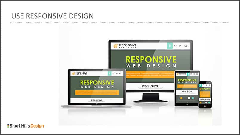
Responsive Design is often called "mobile-friendly" or "mobile ready" but responsive design is a broader term.
Responsive design is the concept that a website will display in a particular way based upon the screen on which it's being displayed. Thus, the modern way to think about a website is like the old adage from science class that, "a liquid takes the form of its container."

The underlying code for a responsive dental website doesn't change -- what DOES change is the style. The table below shows a few elements from a website and what changes or doesn't change based on the device re: responsive design.
| Website Element | Desktop | Responsive (tablet, smartphone) |
|---|---|---|
| text | no change | no change |
| image sizes | standard | reduced for smaller screens and to conserve bandwidth |
| hero/slider area | standard | modified so there's no slider, or removed completely and replaced with text. |
| navigation | standard | condensed on a tablet, replaced with the hamburger icon on a smartphone. |
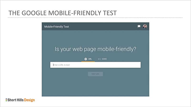
No way! In 2022 every website should be built in a responsive manner. You can check to see how well your site performs on a mobile device by using Google's Mobile-Friendly testing tool. It will a) show you what your site looks like on a mobile device, and it will let you know b) if there are any mobile-related issues on your site that should be fixed (e.g. "elements too close together").
Questions about responsive design or about results from the mobile-friendly test? Get in touch with us today so we can help!
Dr. Wank has been at the helm of Short Hills Design since he founded the company over a decade ago and is the author of the Small Business Web Design Workbook. Dr. Wank currently serves on the editorial advisory board for DentalTown magazine and writes their web development CE course.